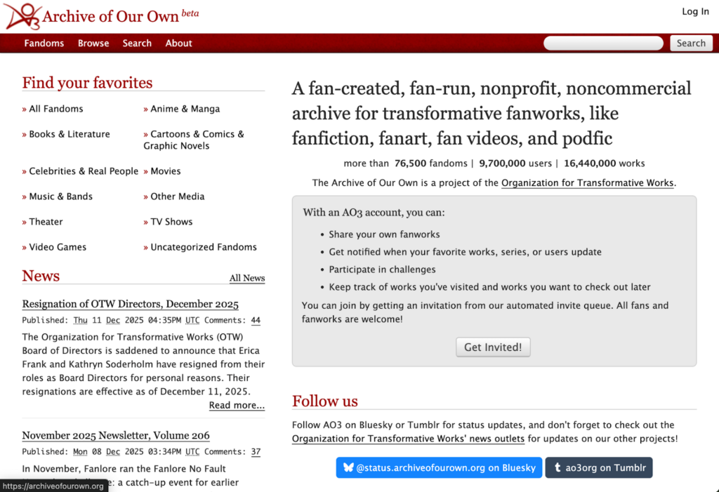
Design 1: Archive of Our Own (AO3), a website where people can upload fanfiction for others to peruse. Analyzing the site’s main page, it’s plain, the color palette consists of red, black, and white. The white background allows the viewer to focus on what’s written on the page. There are three instances on the website that draw attention: a grey rectangle that encourages visitors to create an account, the other two instances being more disruptive due to the blue colored hyperlinks (contrast). The blue color choice is in relation to the other websites it can take you to, light blue and a darker blue corresponding to the AO3 accounts on Bluesky and Tumblr respectively. I would change them to red because it’s disruptive to the harmony, or I would move them down to the hyperlink section to create a fourth column/category.
Using the What the Font extension, I identified two fonts; whoever designed the website chose one for the titles in red, and the other for whatever is written directly beneath in black (hierarchy, similarity, repetition). The writing is aligned to the left and the alignment makes it so that there’s two columns, but the way the text is grouped feels somewhat cluttered and simultaneously scattered (proximity, negative space), therefore I’d say it lacks balance. I would recommend adding the logo and log in to the red bar with the other options. I want to have them equally spaced with a wider red bar, I’d also remove the ‘Find Your Favorites’ to avoid redundancy and switch the ‘News’ to the right as well as replace the search bar with a magnifying glass icon for better symmetry and order.
There’s also a hyperlink section at the very bottom (not pictured) that lacks balance. I’d switch the order that the categories are listed so the category with more links is in the middle, I’d also align them to the center since it’s three categories; less white space, more balance. The main page is fairly short, but the ‘News’ section gets cut off which gives the sense of continuity. You can see common fate in the ‘Find Your Favorites’ section, the arrows point to the right, the fact that they are red could indicate that it could lead the viewer to more options. No closure that I could identify.
Overall I understand that this website is more geared toward people that have been recommended the site versus a site like Wattpad, that has a more fly-catching type of appeal to people that are new to it. I’d say AO3 has a more humble or quaint aesthetic due to funding differences, it doesn’t run ads (Wattpad does and they made it so you have to pay to access certain features, but don’t quote me on that. I stopped using Wattpad a little before they started getting greedy with their stuff). AO3 is very to the point, you can browse through the ‘Fandoms’ if you don’t know what characters you want to read about, but the site doesn’t actively spotlight or promote reading any of the works uploaded on their site. It’s an effective site in the sense that you’re getting what you came for, whether it be fan art or fanfiction there’s all kinds of imaginative things on there, but it’s up to the viewer to decide if they want to dig around to find something they’d enjoy. Like I mentioned previously, there are adjustments that could be made to attract more readers, or to improve user experience. I don’t love the look, but I like how straightforward it is.
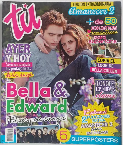
Design 2: Tu Magazine, this is a Spanish magazine intended for teen girls. There’s a lot going on colorwise. The neon of the lettering in the foreground creates a notable contrast between the muted colors of the background picture featuring the leading actors in the movie Twilight. We see similarity and repetition in the color, size, and font choices, but the variation also draws your eye to it. The way the words are aligned centers the picture and while it is asymmetrical, it’s ordered in a way that feels balanced. Despite close proximity, the varying font sizes give us hierarchy, bigger bolder fonts catch the reader’s attention and the smaller thinner fonts are used to add context. Closure is apparent in the way that the yellow sun/star shape is blocked at the bottom by the blue rectangle, but we know that the points on the yellow shape keep going. The continuity is more so specified in the writing itself, you can ‘Copy Bella Cullen’s Look’ by looking through the magazine. Proximity is seen in the way that the one liners are grouped together, since most of the text is large and there is something to look at at every part of the magazine, this gives us an example of negative space. No common fate that I could identify.
The design of this magazine is very intentional with their bright color palette to draw attention from afar. It’s a lot to look at, but the large fonts indicate what is most “urgent” to read. I’d describe this cover as eye candy because it can be overwhelming, but it draws your interest for longer so you can read the one liners. While overwhelming, it also evokes nostalgia. I have personally never bought magazines, but I can remember waiting in grocery store checkout lines and seeing magazines like this as a kid and wanting to get one. Especially if it had some cute celebrity or fashion/style inspiration. This magazine is effective that way, so I wouldn’t make any changes to it other than maybe making the font more similar, but that would take away from the fun and whimsy it promotes and not appeal to the youths.